Color Psychology in Branding: Understanding the Most Essential Concepts
Do you know colors contribute to almost 90% of the first impression? This is what brand marketers are incorporating into color psychology in branding. And not only the first impression. Colors can even impact people’s moods and behavior. When you’re starting a branding journey, facts like how the human eye can distinguish 10 million colors can be overwhelming.

Image Credit: Pixabay / Geralt
However, the science behind color psychology can change the game for you. Hence, successfully combining this aspect into your branding or eCommerce business, along with other considerations, can help you thrive. In this comprehensive blog, we will discuss how to choose a suitable brand color with step-by-step guidance. In addition, you’ll find some interesting facts about colors, brand stories, and the human mind. Hop on!
What is Color Psychology?
Different colors and shades stimulate the human mind differently. Color psychology discusses that.
Basically, this topic includes how color affects human emotions, goals, tasks, decision-making, and other aspects of daily life. And it’s a no-brainer that color preferences and their impact may vary according to personalities, surroundings, culture, and age groups.
Color psychology in branding: How colors impact eCommerce and branding
Choosing the right color tone for your eCommerce store or brand is essential. This is because colors influence a customer’s perception of brand services. Let us look at some interesting facts to find out more:
The mood of your customers may vary depending on the color of your site
Nowadays, the customer attention span is close to 50 milliseconds. Hence, this fraction of time is enough to draw or take away the customer’s focus from your site.
Too loud or too dull user interfaces can ruin the entire deal. In addition, over 50% of web users avoid returning to websites with substandard styles. Hence, to ensure your customers keep coming back to you, you need the right color concept to evoke interest and impact on sales psychology.
Colors often interfere with a person’s buying decision.
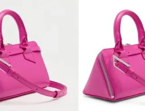
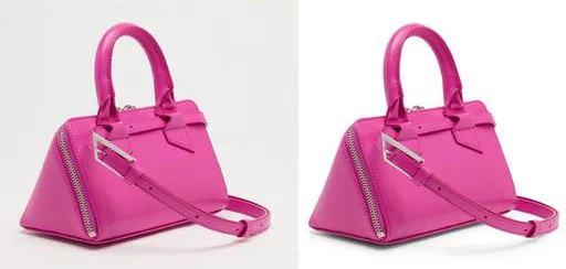
For example, eCommerce product photos need the right color combinations, accurate shadows, and a natural tone to attract visitors. Let us consider the following picture:

The first photo is a sample from our clients, and our expert team at FotoMasking edited the second photo. It’s the same product, but the second one features a naturally vibrant shade. So, which one of the product photos will be more appealing to customers when buying? We’ll let you decide.
Colors are like brand voices
According to studies, the right aesthetic boosts brand recognition by up to 80%. Like when I say KFC (previously known as Kentucky Fried Chicken), you remember the red and white background containing the portrait of Harland Sanders, founder of KFC. Starting in 1952, KFC has changed its logo seven times, keeping the main color theme intact like a royal trademark!
The right color scheme for your website influences visitors subconsciously
Color psychology in branding is mostly about people’s subconscious minds. Let us give you a real-life example.
While visiting any site, you will often see commonly used CTA options like ”Subscribe now”, ”Start your free trial”, and ”Book your service now”. Usually, red calls for urgency. That is why marketers tend to use a red call-to-action button in those places to induce a sense of action in their audience.
How to pick the colors for your brand
There’s no one-size-fits-all method for selecting brand colors. What works for someone else might not work for you. However, in this segment, we will get back to the basics. As a result, color psychology in branding will be easier to understand. Check this out!
Balance customer perception with personal preference
It’s definitely the tricky part. If you dislike a particular color, you won’t want to use it or see it as your brand color. So, if that specific color is irrelevant to your brand, you can remove it from the list.
Then again, customers’ thoughts and choices will matter a lot. Put yourself in their shoes. Think like them. What color combination would you love if you were the first customer on your site? When you get the answer to this question, know you are almost halfway there.
Learn the meaning of colors
We will continue the discussion above. Putting yourself in the consumer’s shoes and getting your answers will be much easier with additional knowledge of color psychology in branding. So, learning relevant colors’ meanings and underlying messages may be a giant leap forward for you.
We prepared the following chart to give you some fundamental color interpretation ideas.
| Color name | Positive meaning | Negative meaning |
| Blue | Security, strength, wisdom, logic, dependability, trust | Coldness, unfriendliness, emotionless |
| Red | Power, passion, excitement, urgency, energy | Danger, pain, warning, anger |
| Green | Health, nature, freshness, organic, hope, growth | Boredom, envy, blandness, stagnation |
| Purple | Wisdom, wealth, imagination, spirituality | Reflection, suppression, excess, moodiness |
| Yellow | Youthfulness, brightness, happiness, optimism, creativity, extroversion, warmth | Fear, irrationality, and anxiety, caution, frustration |
Craft your business identity
What kind of brand or business do you have? What services are you planning to sell?
If you own an online bookstore, think about your website’s first impression. Also, come up with some phrases that go along with it. Words like local, classic, cozy, elegant, comfortable, extensive, library, and collection can help define a bookstore.
Hence, while choosing a color palette, remember the impact of these words on the selected colors. For that, colors or duo shades of light brown, beige, yellow-green, chocolate brown, peach, turquoise, and lavender would look great. And make sure to avoid loud colors in that case.
Analyze similar and successful brand color compositions
Market research is a crucial step in selecting your desired brand color theme. While you’re at it, your competitive peers can be a great resource.
- Try to look for similarities between several brands’ colors.
- Make a list of the most used colors.
- Check out the customer response.
However, do not lose yourself in the way
Yes, it is perfectly fine to take ideas from fellow businesses or brands. You want to stand out in either case, so let your creativity shine. One excellent way to stay on top of the game is to use color contrast, gradient shades, or different shades of any pure color. As always, your target audience and brand identity will play the ultimate role.
Experimenting is the key
Trial and error are part of the process. Consider experimenting if your studies and gut feelings suggest a specific color group, but you are unsure. And you can also conduct a pilot survey to know your potential customers’ opinions. Experimenting is fun, and even if your first few rounds do not succeed, you will gradually understand how to fix it.

Some famous color branding ideas
With color branding, famous brands make an impactful and lasting impression. Customer attention and universal brand recognition are the core of every brand color. Moreover, the brand color represents how it communicates with customers and what message it conveys.
To support our claim, we have presented some famous brands’ powerful color branding messages here. Have a look.
Nickelodeon: Remember our favorite childhood cartoon channel? Nickelodeon has this iconic orange logo, which blends creativity with playfulness. And that perfectly matches their unique branding and fun programming.
Google: Google’s vibrant rainbow logo immediately stands out as an expression of its innovative and creative philosophy.
eBay: From the eBay logo and official website, we can see red, blue, yellow, and green colors overall. eBay’s bright brand color palettes allow customers to visualize their e-commerce store vision.
Coca-Cola: The color red and Coca-Cola go hand in hand. More importantly, Coca-Cola has the correct concept of red as its brand color. So, adding energy to the signature concept perfectly complements its energetic vibe.
Apple: Apple selected gray, black, and white as their brand colors to portray elegance in every device they make. Additionally, this color combination creates a sleek and modern appearance for the product.
Wrap up
Even the most conventional ideas can fail, and the most novel ideas can see the light of success in branding. That means the game of color psychology is uncertain. And the harsh truth is it won’t skyrocket your sales overnight. Hence, proper knowledge, continuous practice, and conceptual clarity can shape your color decision-making.
However, with one blog, it is quite a task to go through all aspects of color psychology in branding. We have covered all the necessary sections here. After reading through all the topics listed above, we hope you can make an informed decision about your business’s color scheme. Wishing you luck with colors!
References
Shopify, Printful, Mageworx

